Branding
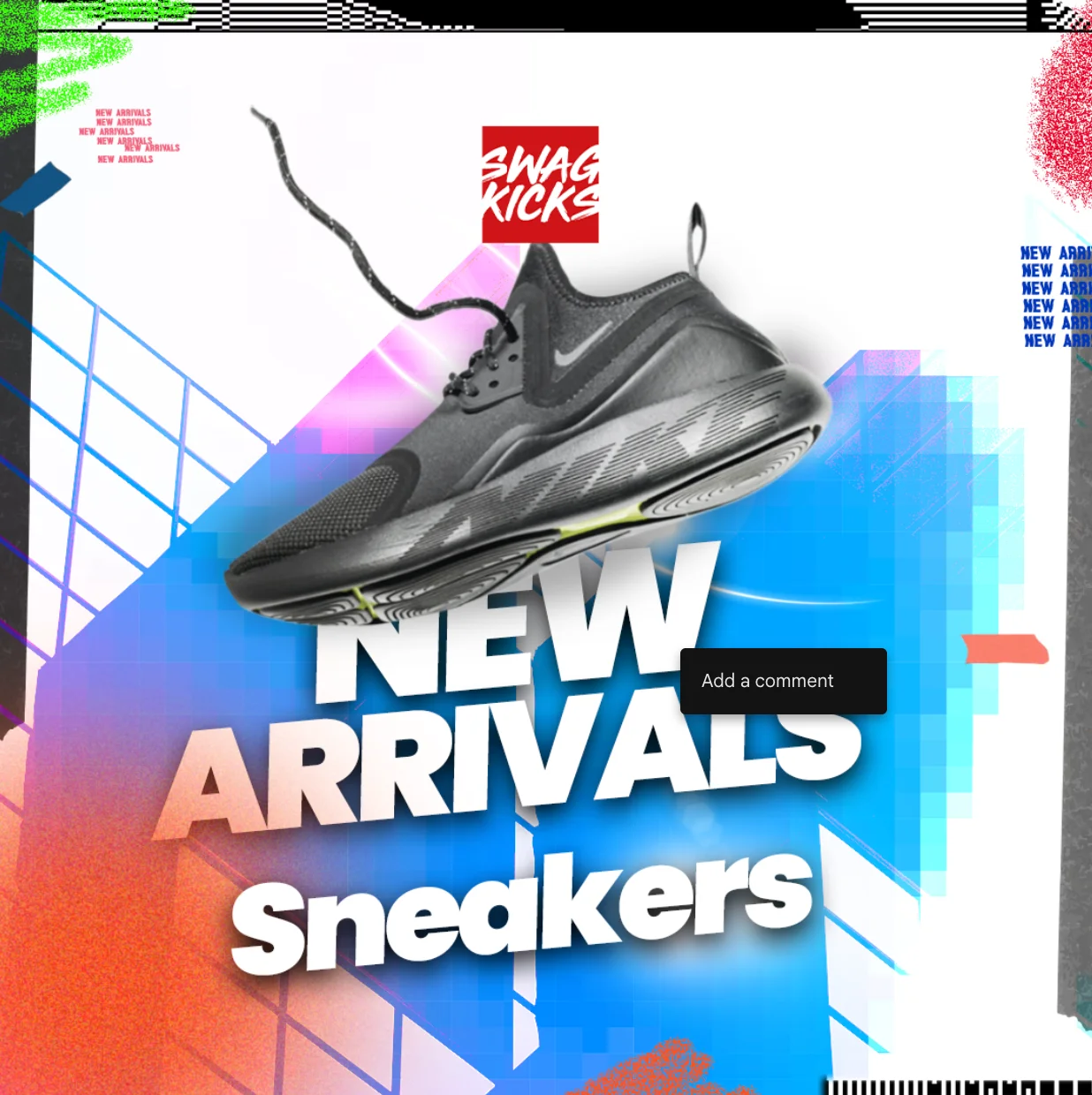
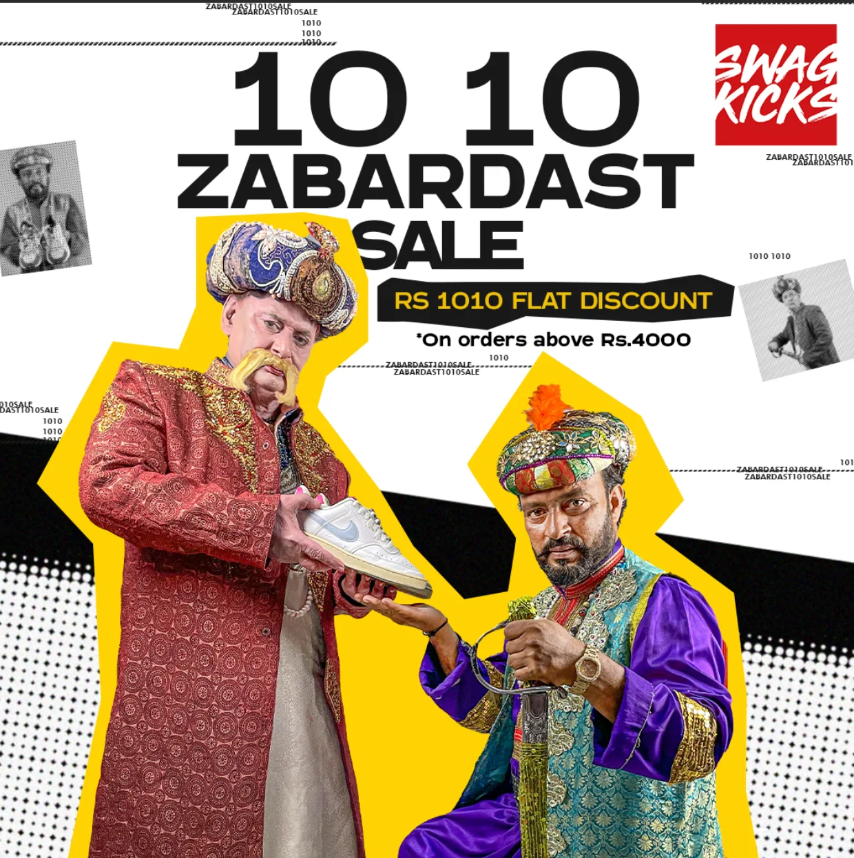
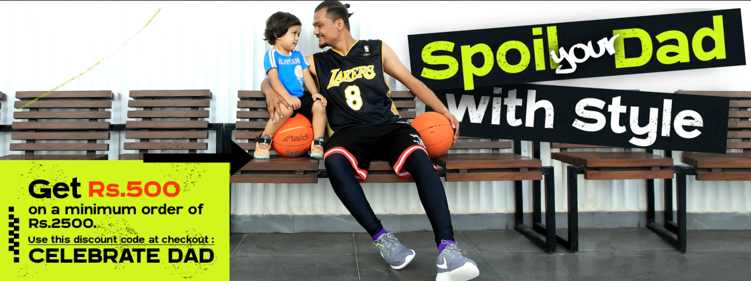
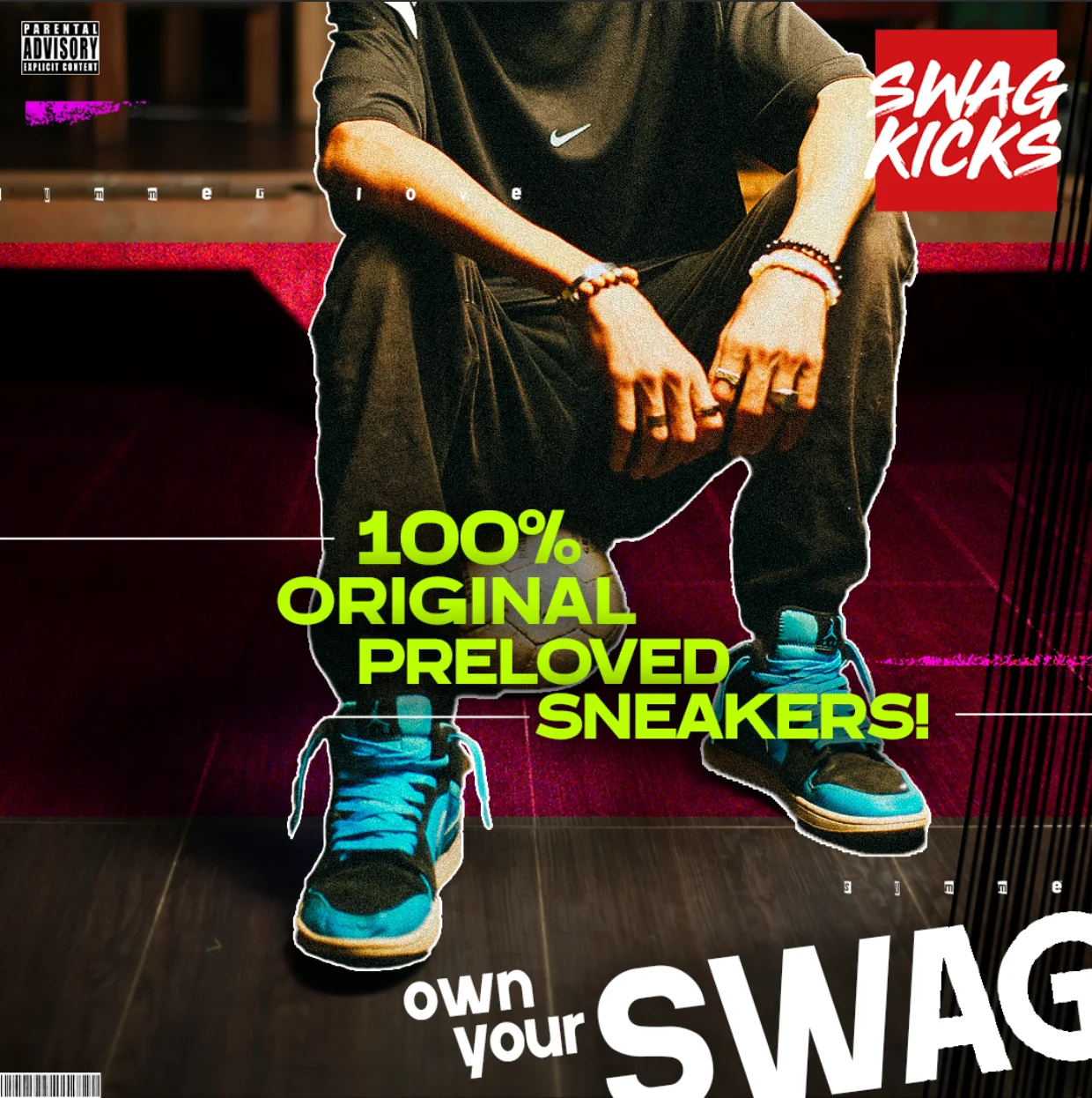
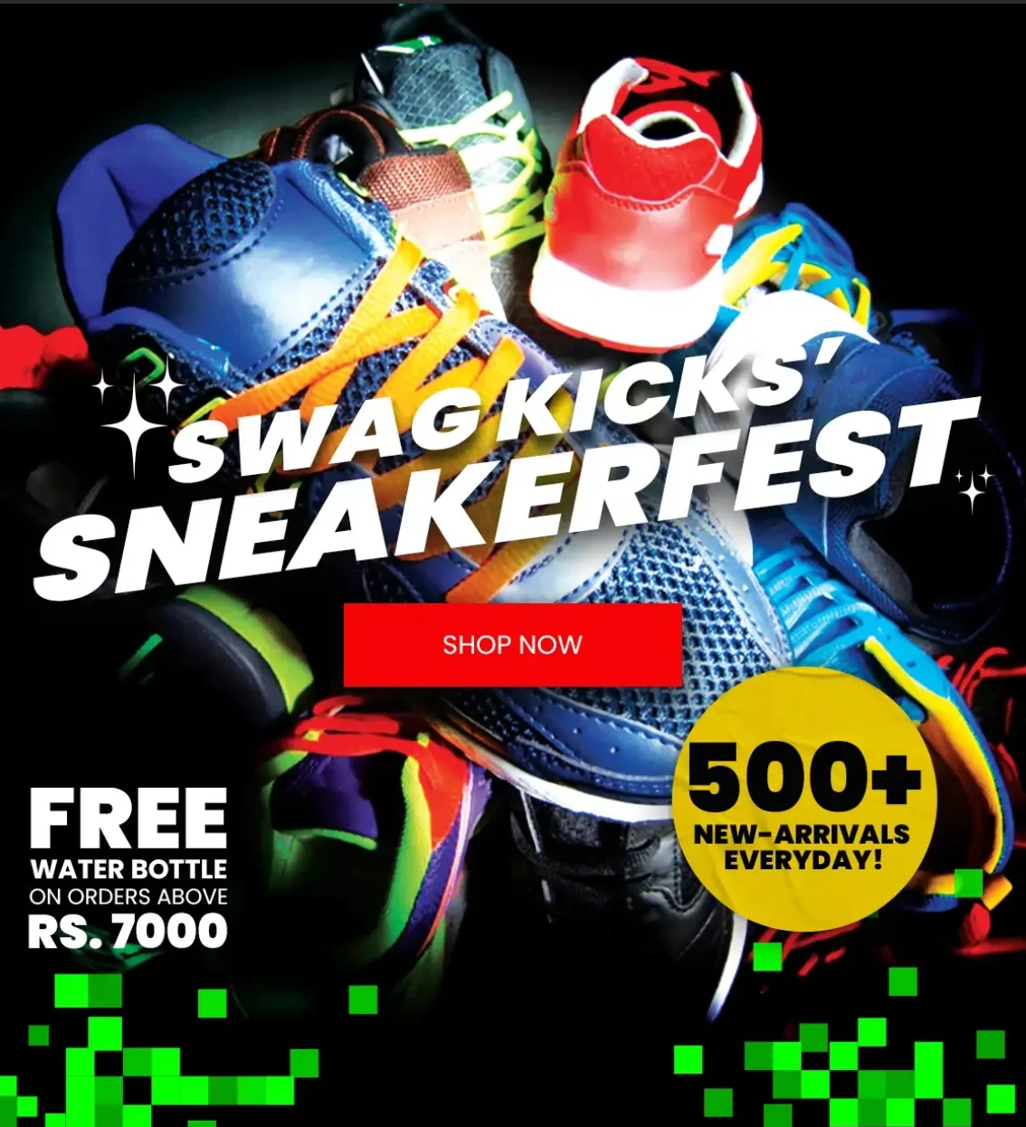
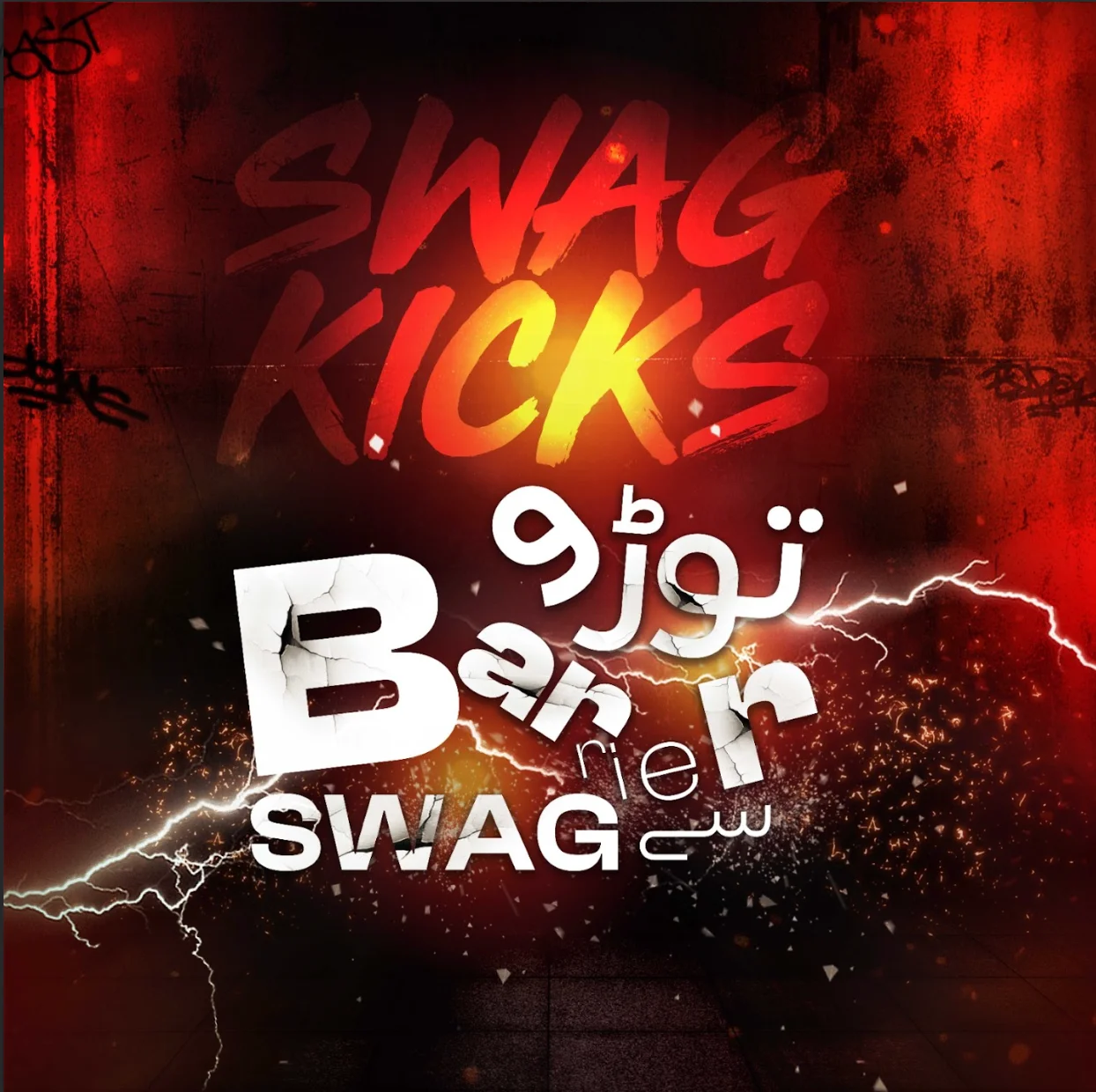
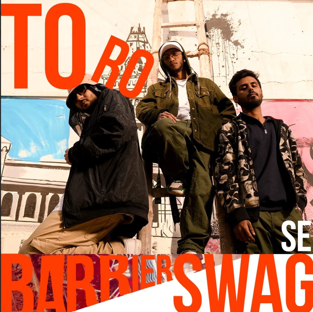
Swag kicks
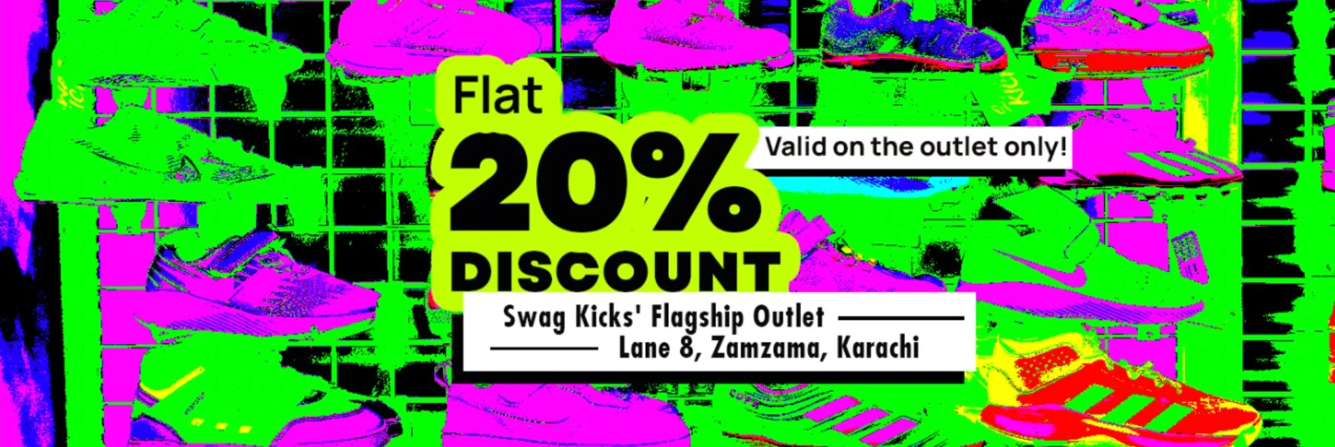
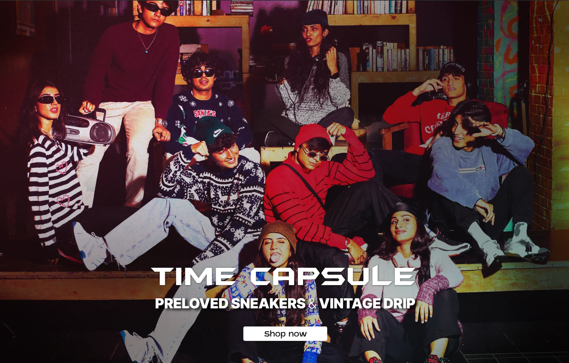
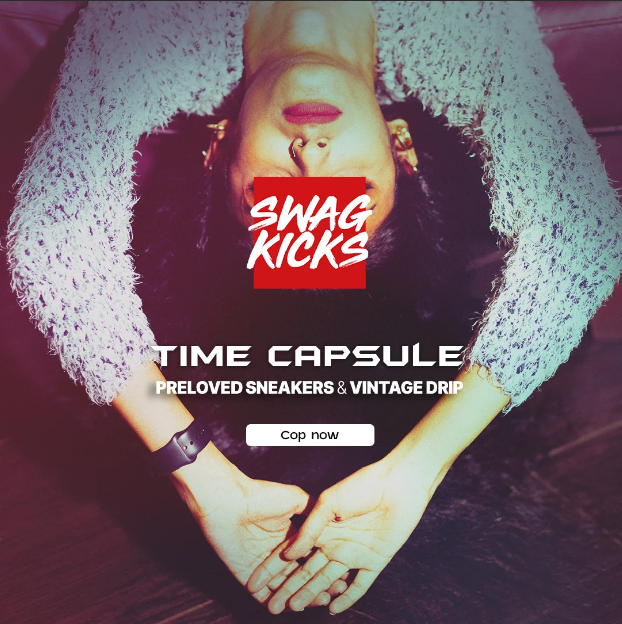
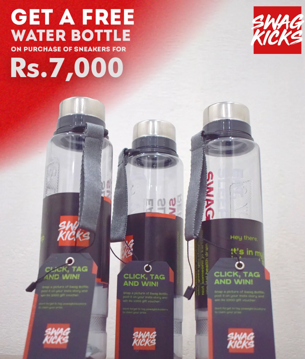
As Creative Lead at Swag Kicks, Where do I start? I had the opportunity to work in a fast-paced, dynamic environment where creativity thrived on collaboration and experimentation. From conceptualizing bold campaign visuals and designing influencer-driven content to leading in-store branding initiatives, every project was an exercise in pushing creative boundaries. The energy was raw, the ideas were fearless, and the process beautifully chaotic. It was an inspiring journey that not only broaden my horizon but also strengthened my creative direction skills and once someone once said to me every chapter ends only to make space for what’s greater ahead
Posch Care
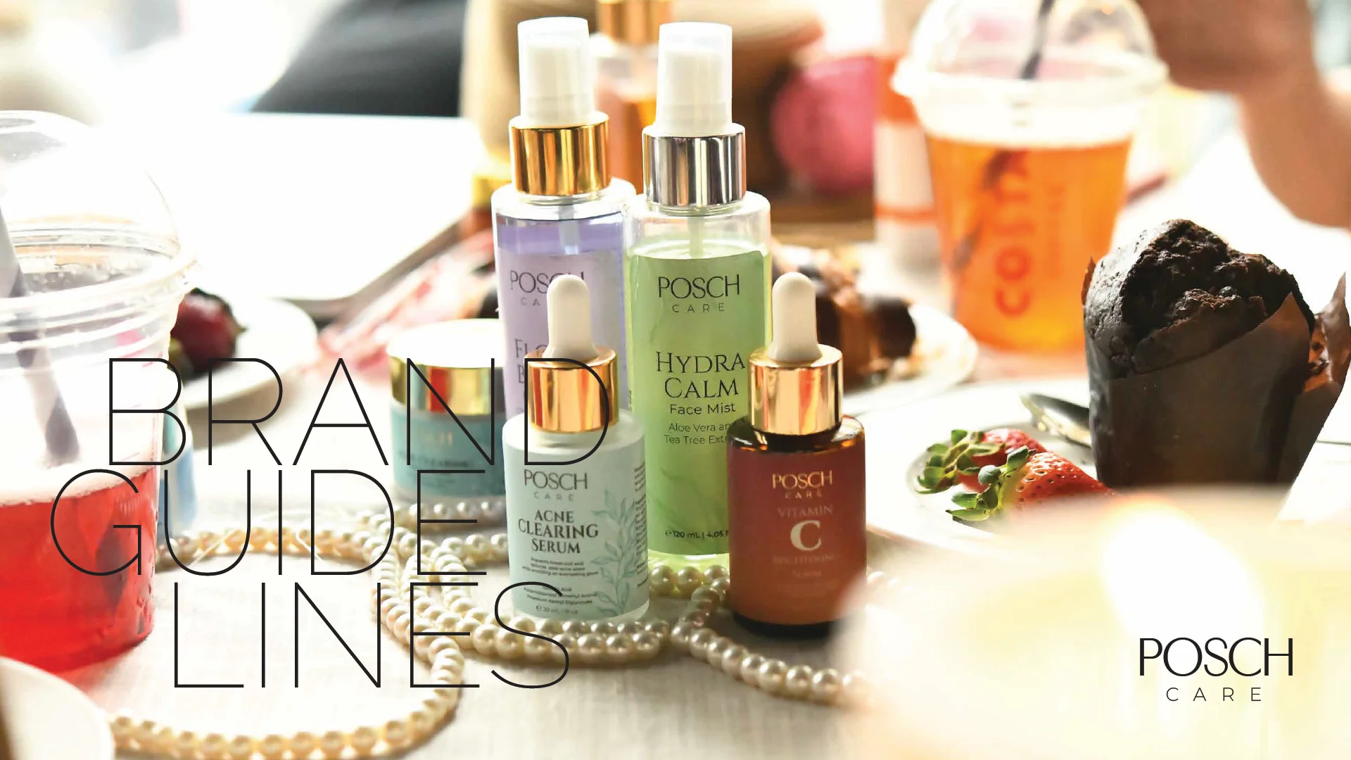
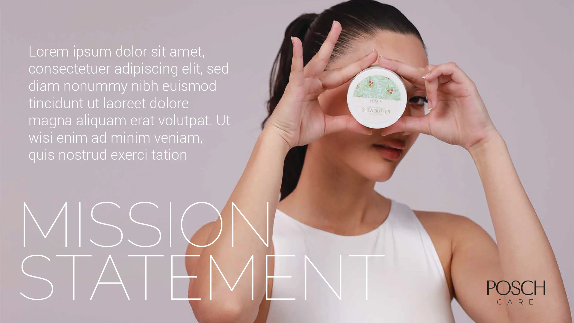
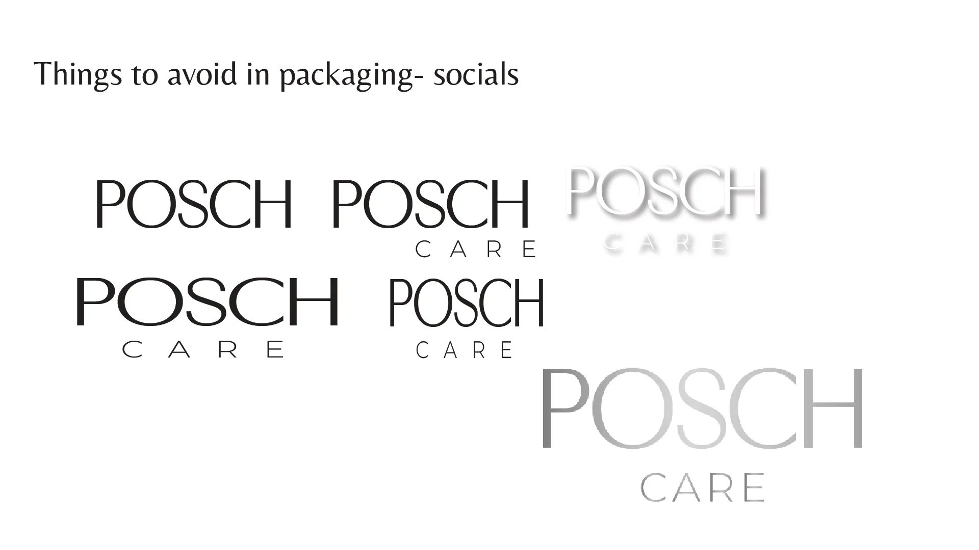
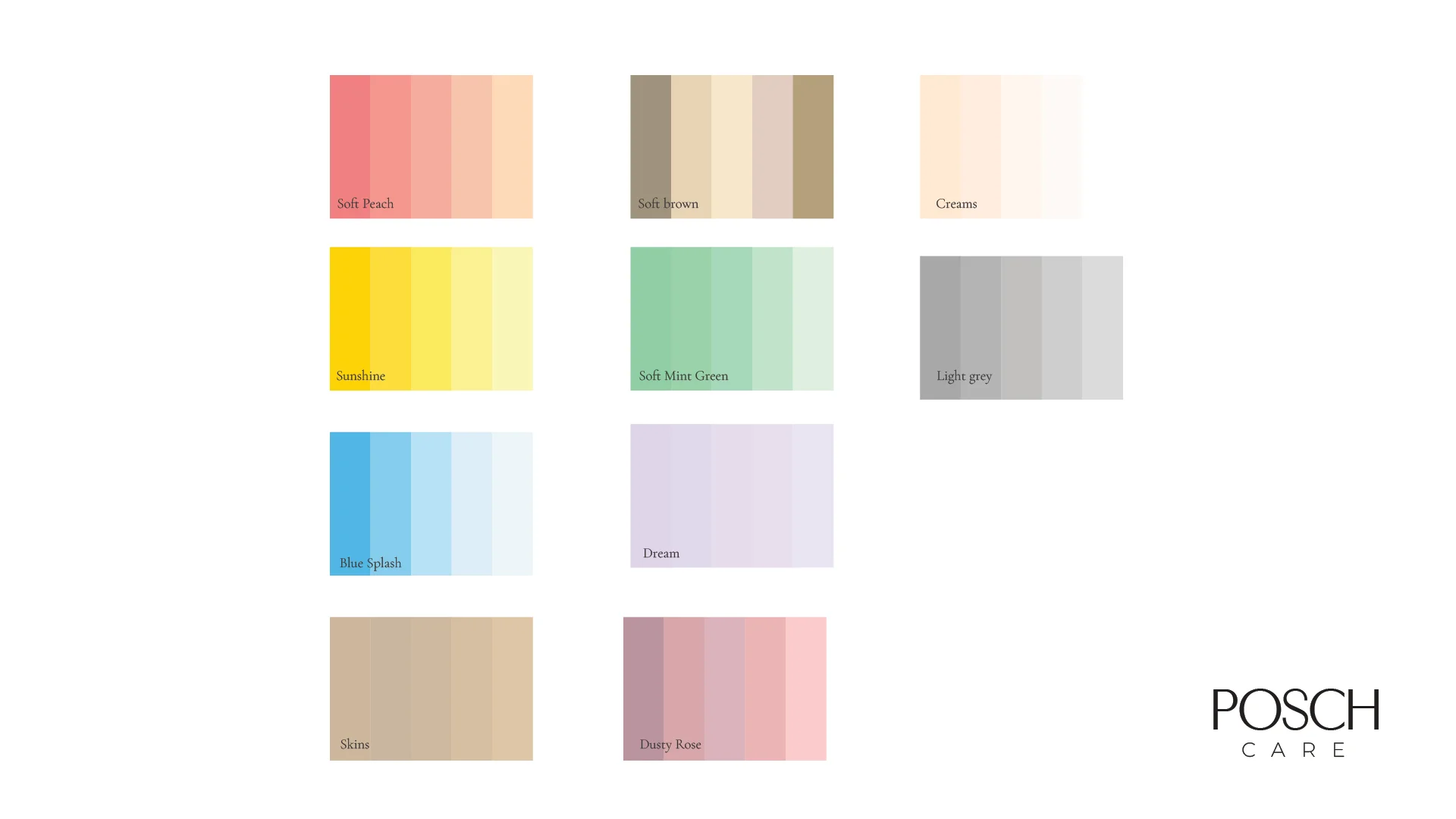
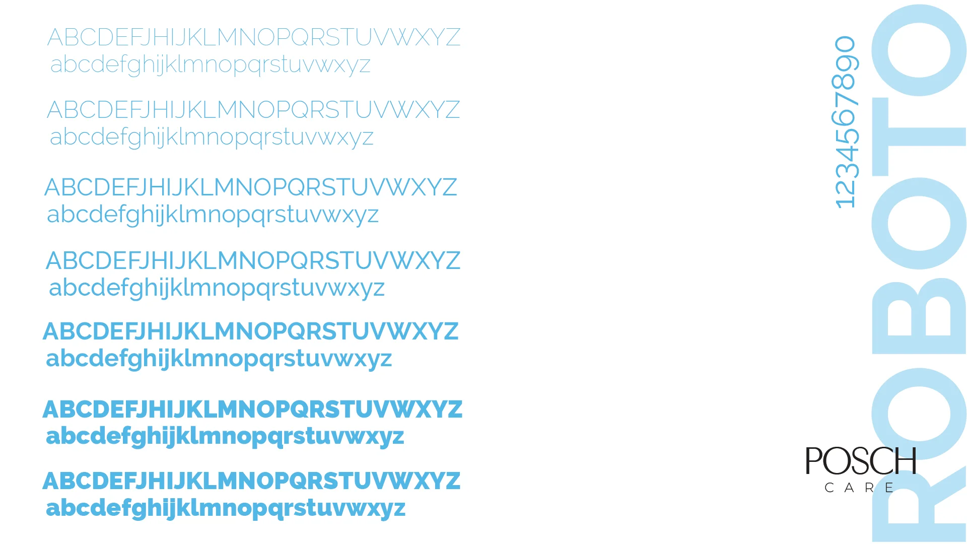
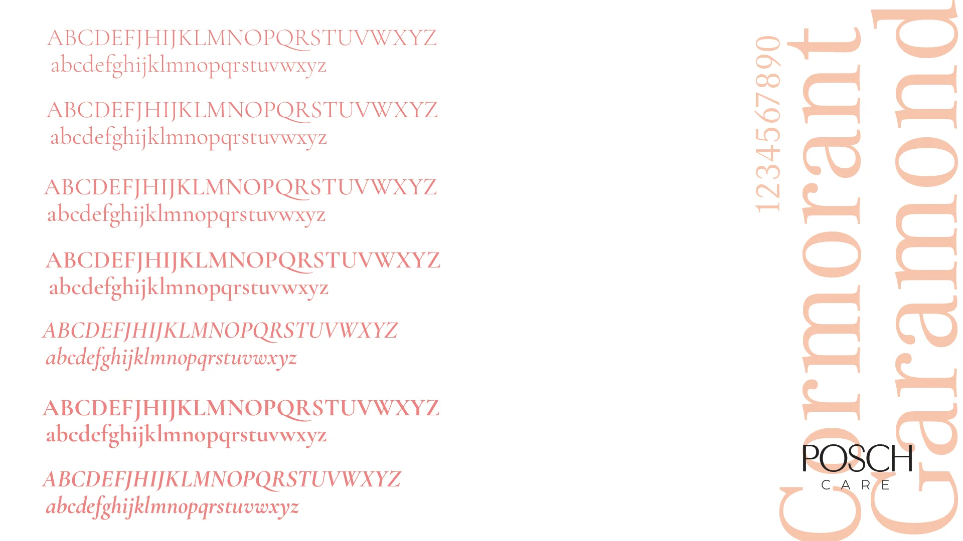
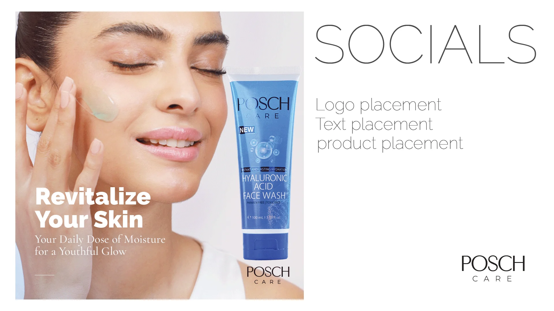
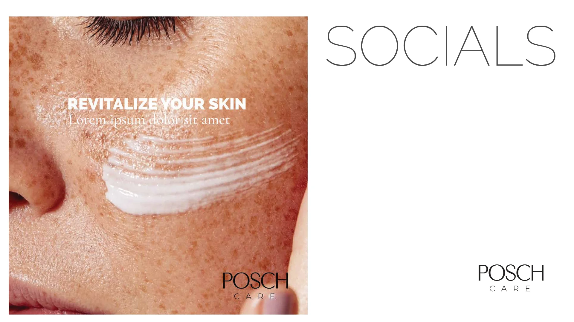
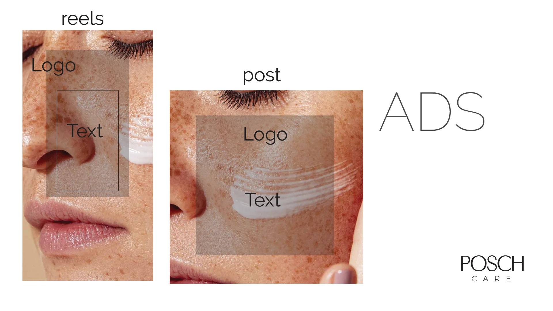
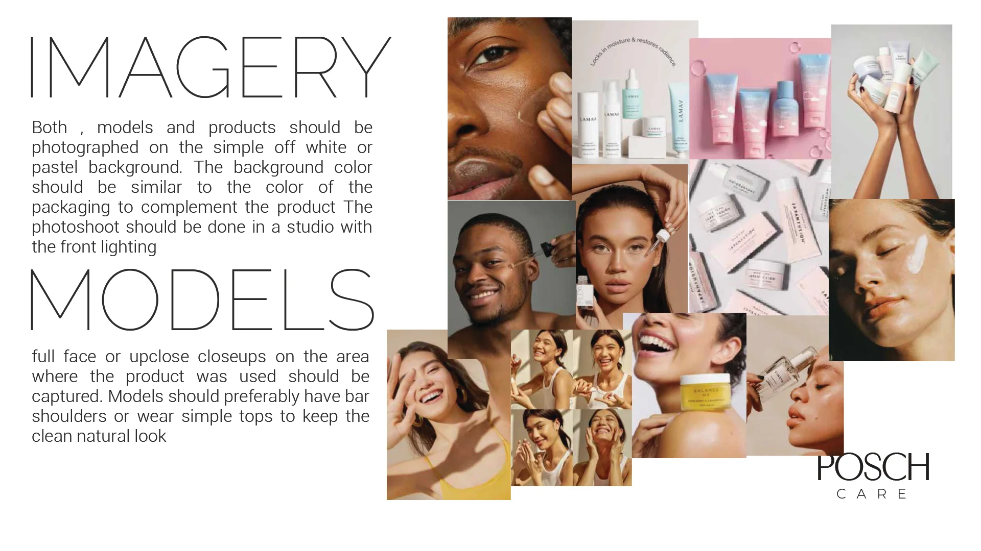
As Creative Lead at Posch Care, my primary focus was to establish a cohesive and impactful brand identity that truly reflected the brand’s core values. The challenge lay in transforming a growing cosmetic label into a recognizable and trusted name through strategic visual storytelling. From refining the logo system and color palette to curating a consistent design language across digital and print platforms, I aimed to build an identity that not only enhanced brand recall but also communicated authenticity, care, and modern aesthetics at every touchpoint.
Wavetec
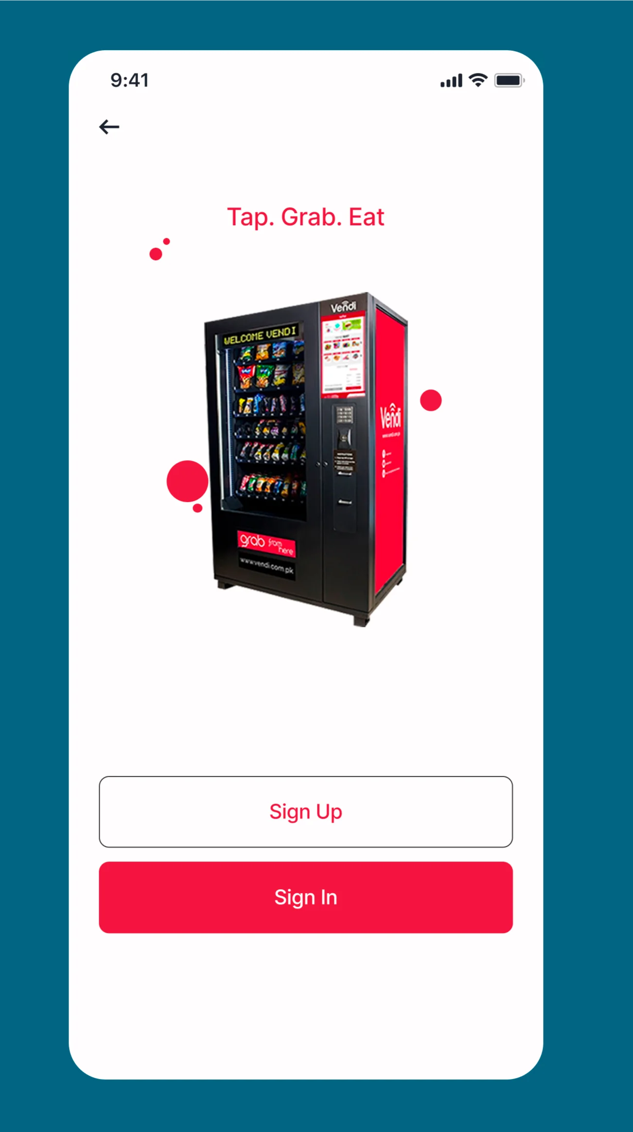
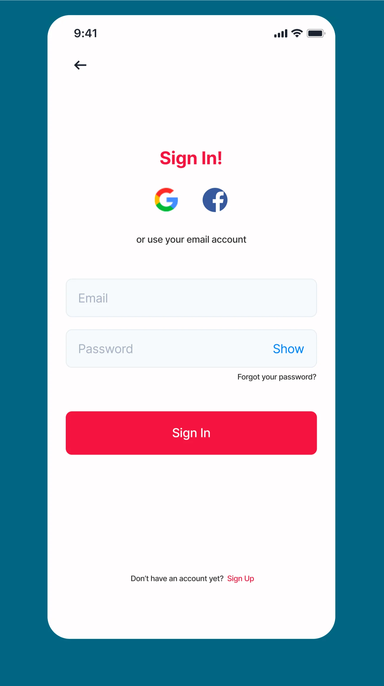
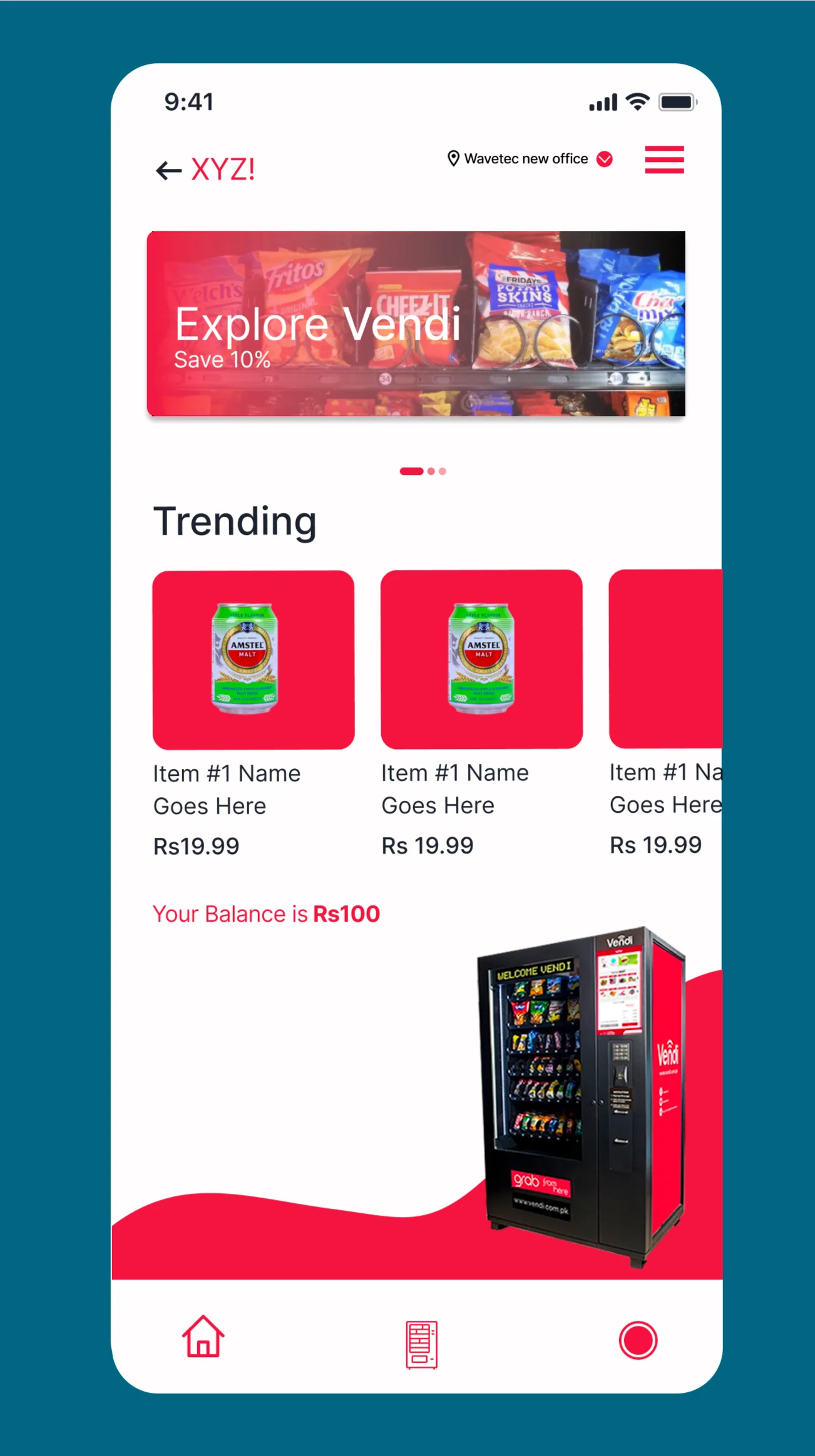
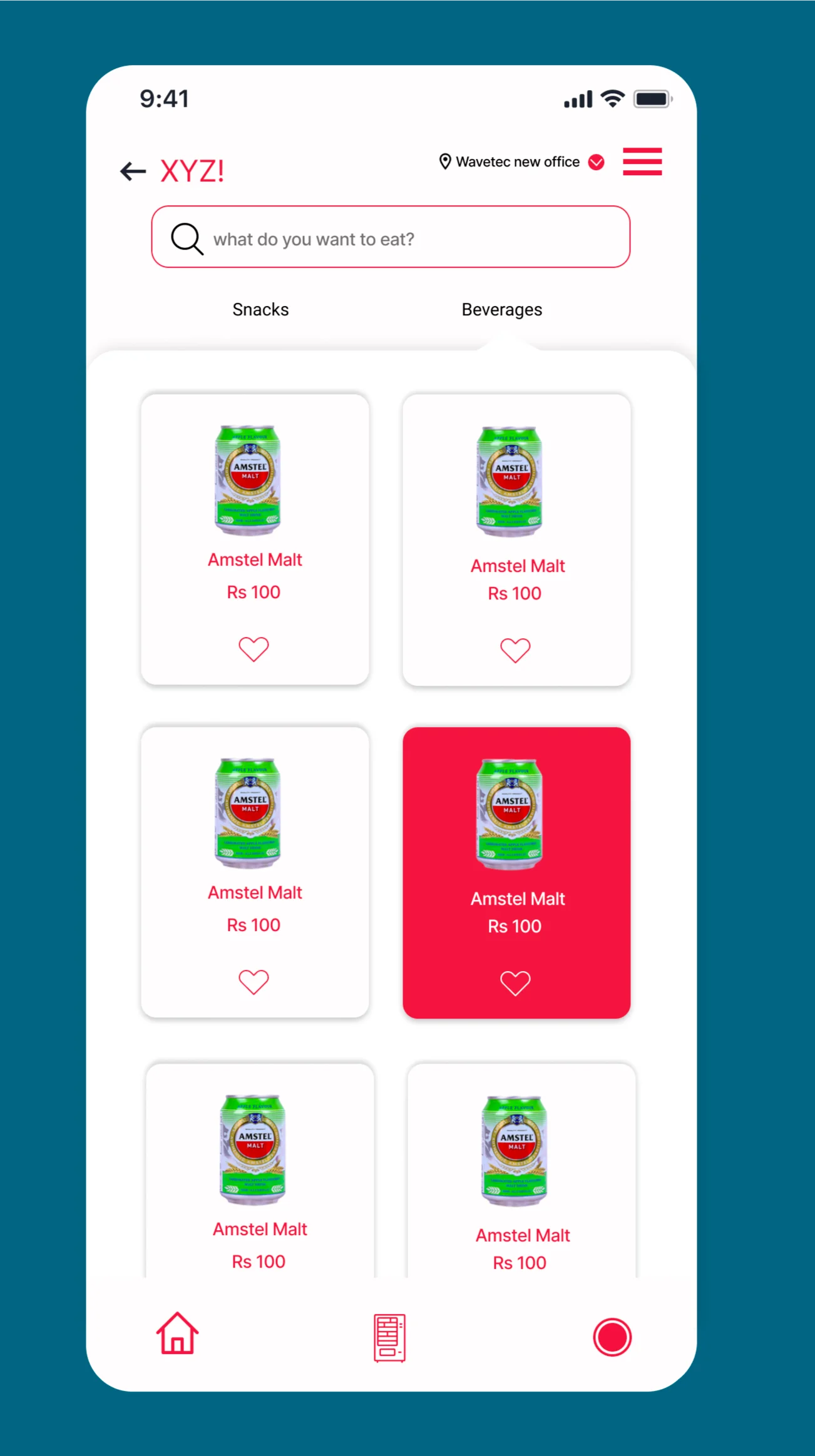
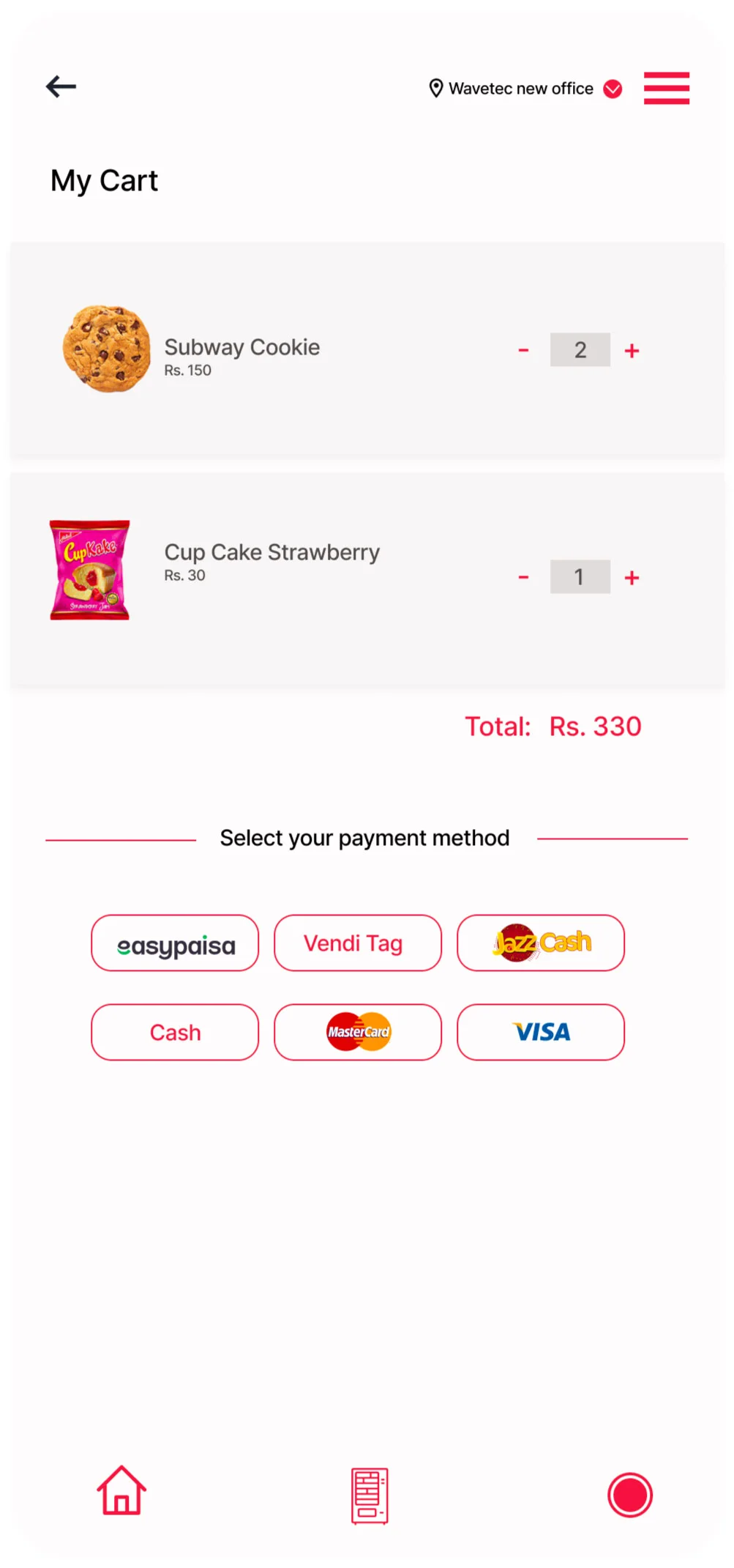
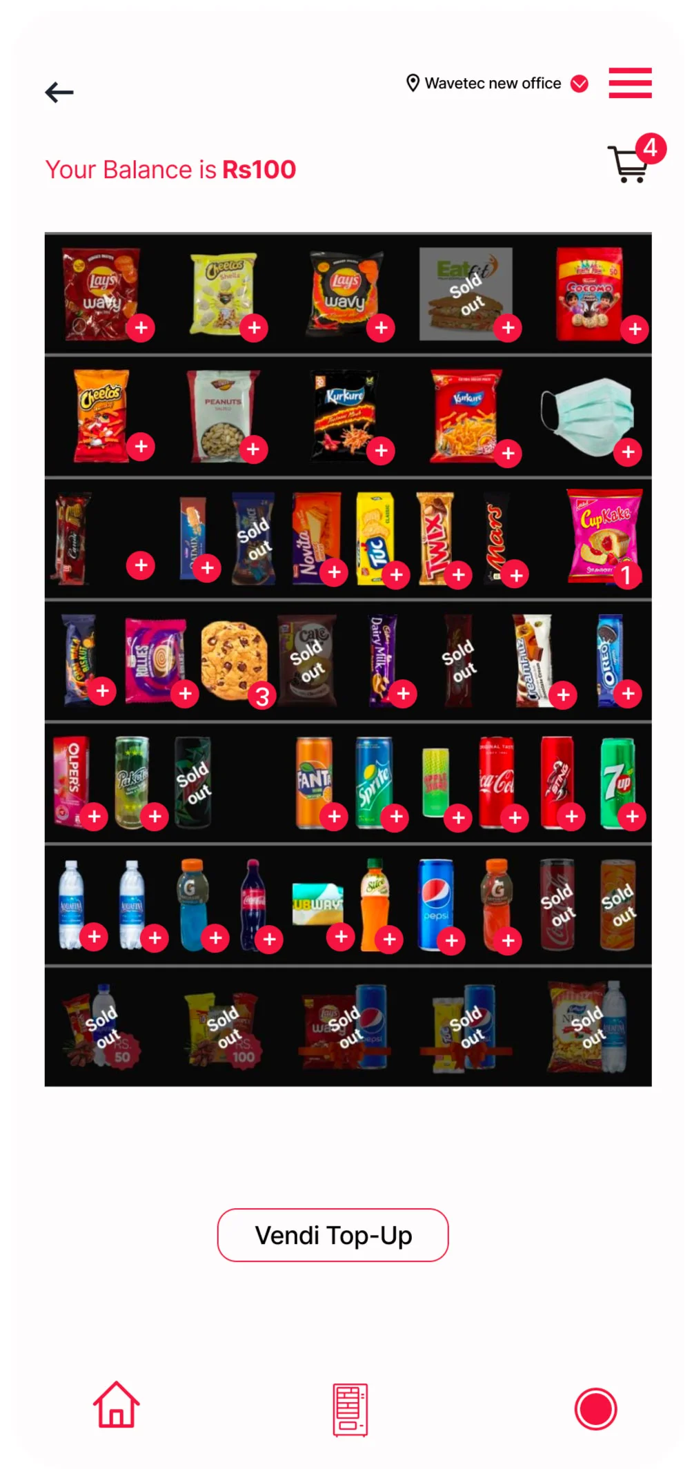
While working at Wavetec, it was a great learning experience. I not only designed skins for vending machines but also worked on the vending machine app draft, outlining the process of dispensing products through the app. I had the opportunity to collaborate with brands like Red Bull, Lipton, and L’Oréal. My time at Wavetec helped me become more self-sufficient and deepened my understanding of both my work and myself.
Hue Garden
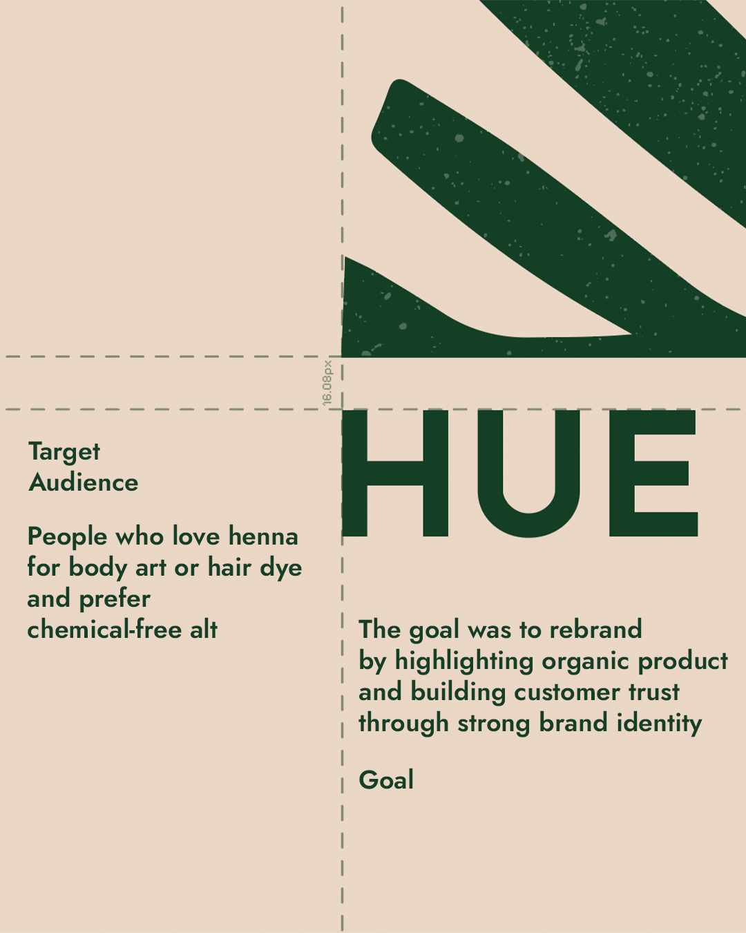
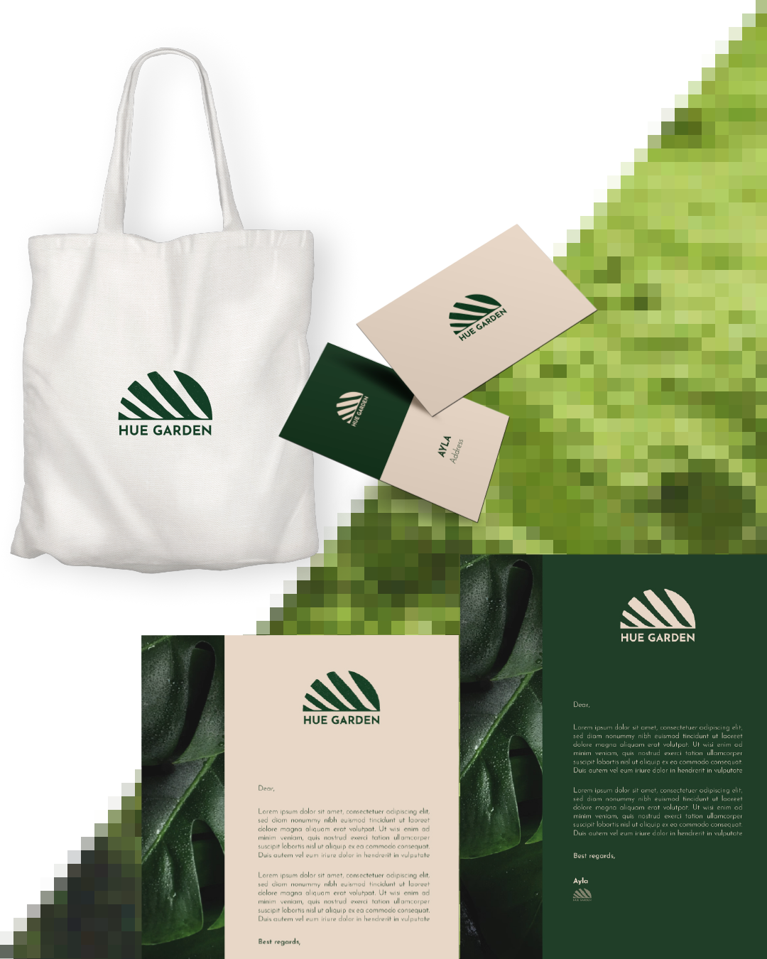
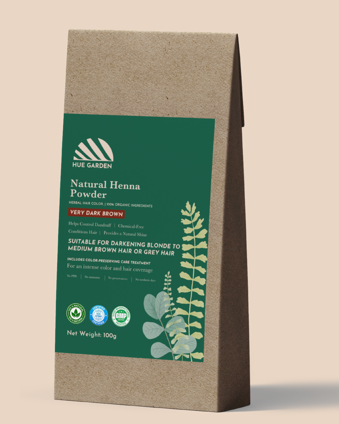
The client approached us to develop a complete brand identity for Hue Garden, a Germany-based henna brand. The goal was to create a distinctive logo and visual language that reflects the organic nature of henna while standing out in a competitive market.
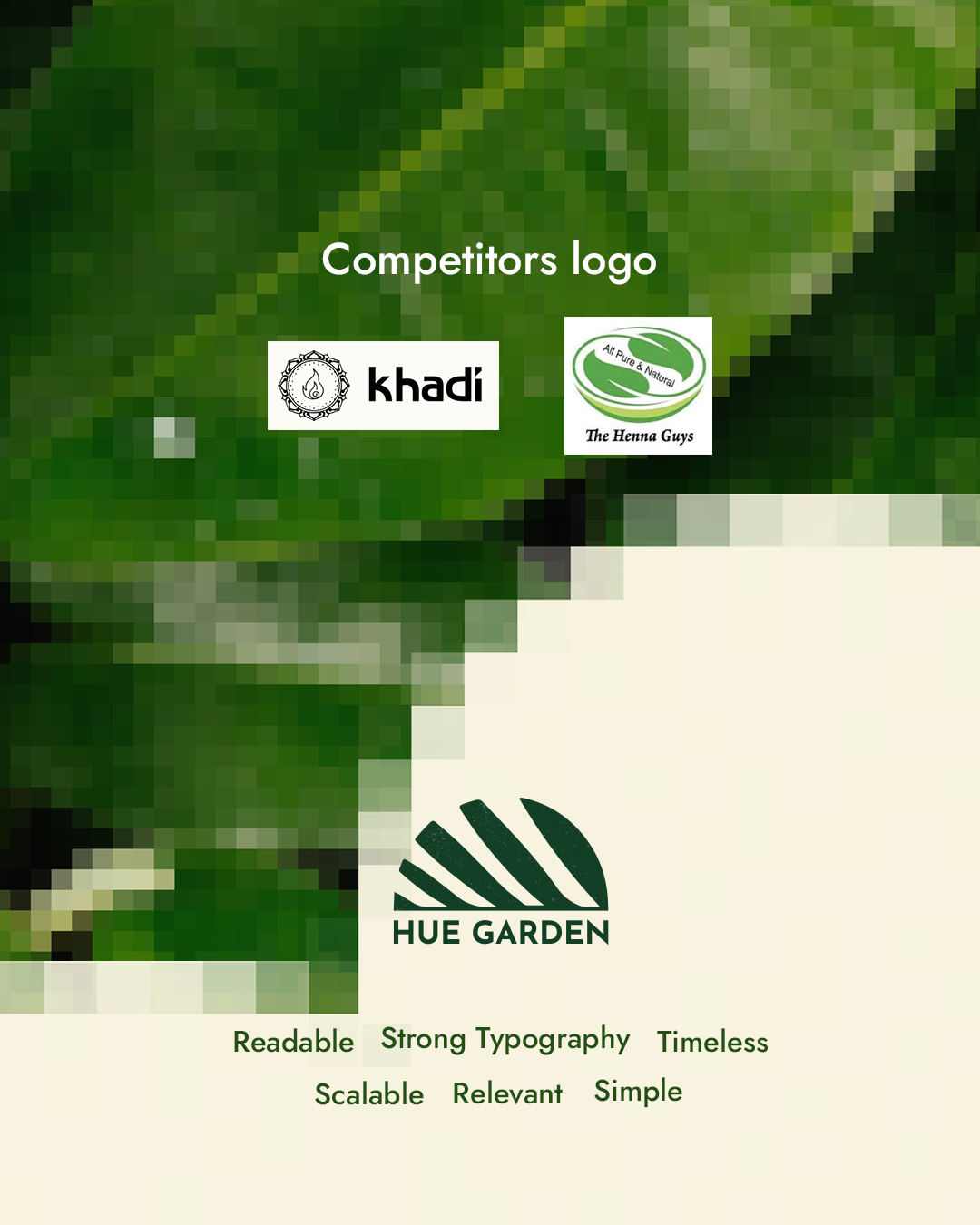
After analyzing regional competitors and industry trends, we developed a unique identity that balances tradition with modern aesthetics. The final branding embodies purity, botanical richness, and the brand’s commitment to high-quality, natural henna products.
Logo: Inspired by natural henna leaves and organic growth, the logo reflects purity.
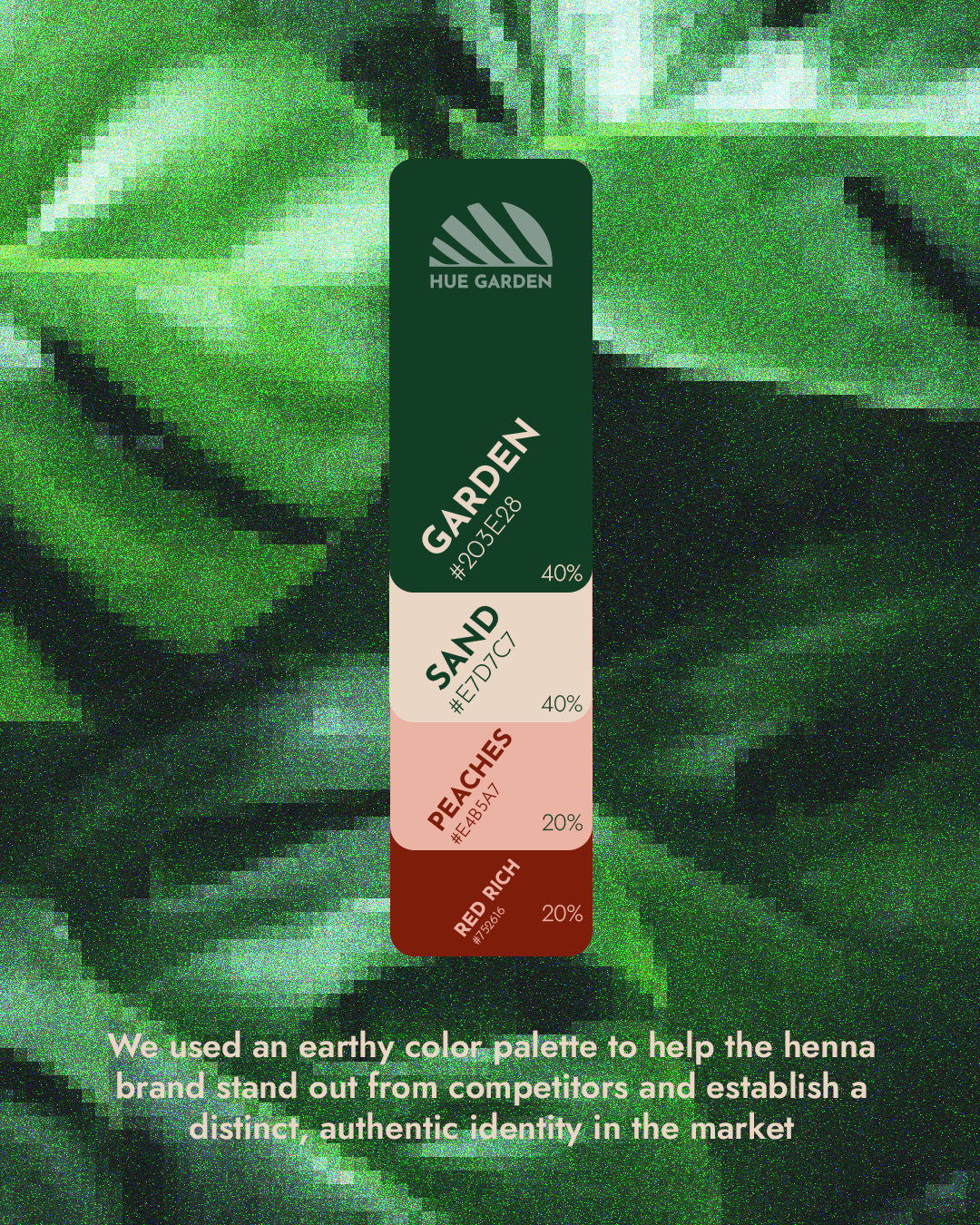
Color Palette: Earthy tones rooted in nature soft greens and muted browns were selected to emphasize organic sourcing and authenticity.
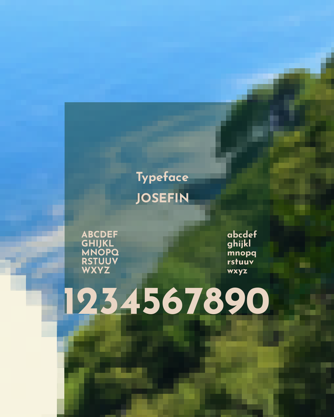
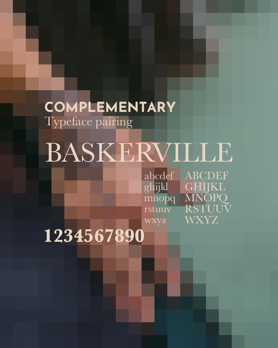
Typography: A combination of serif fonts for a grounded and traditional feel, paired with clean sans serif for clarity and modern appeal.
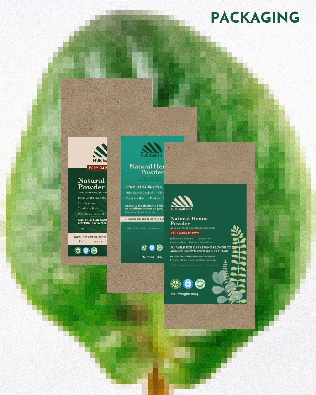
Packaging: We designed maximalist nature led packaging with subtle botanical graphics to highlight product purity and differentiate from visually heavy competitor designs
Adsharx
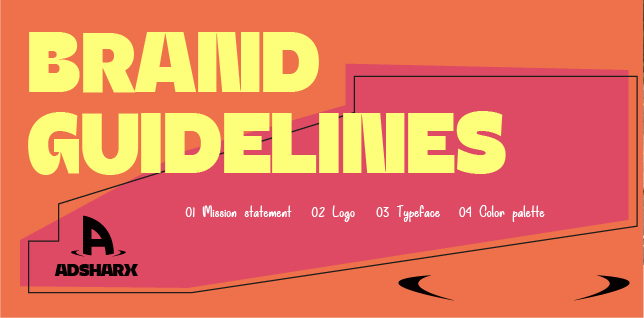
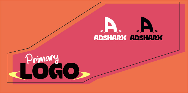
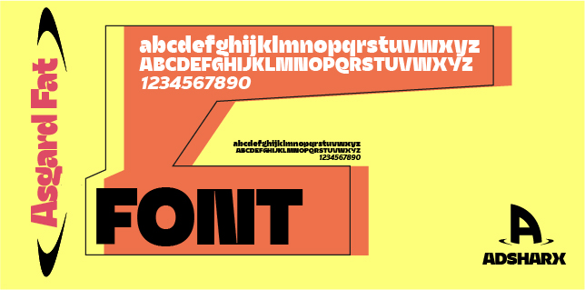
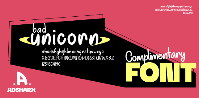
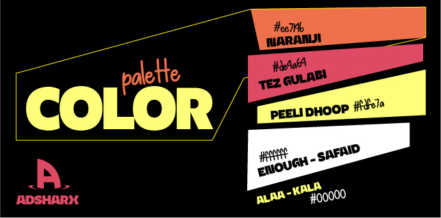
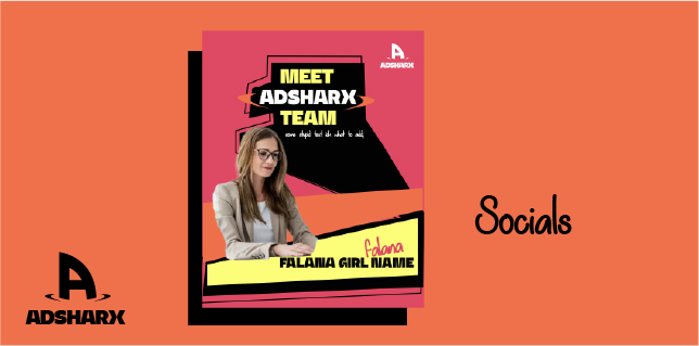
As the founding designer, I set out to build the agency’s visual foundation from the ground up crafting a bold, hip, and quirky identity that captured its free-spirited energy. My focus was to translate creativity into a cohesive brand language that felt fresh, design-driven, and unmistakably original.


