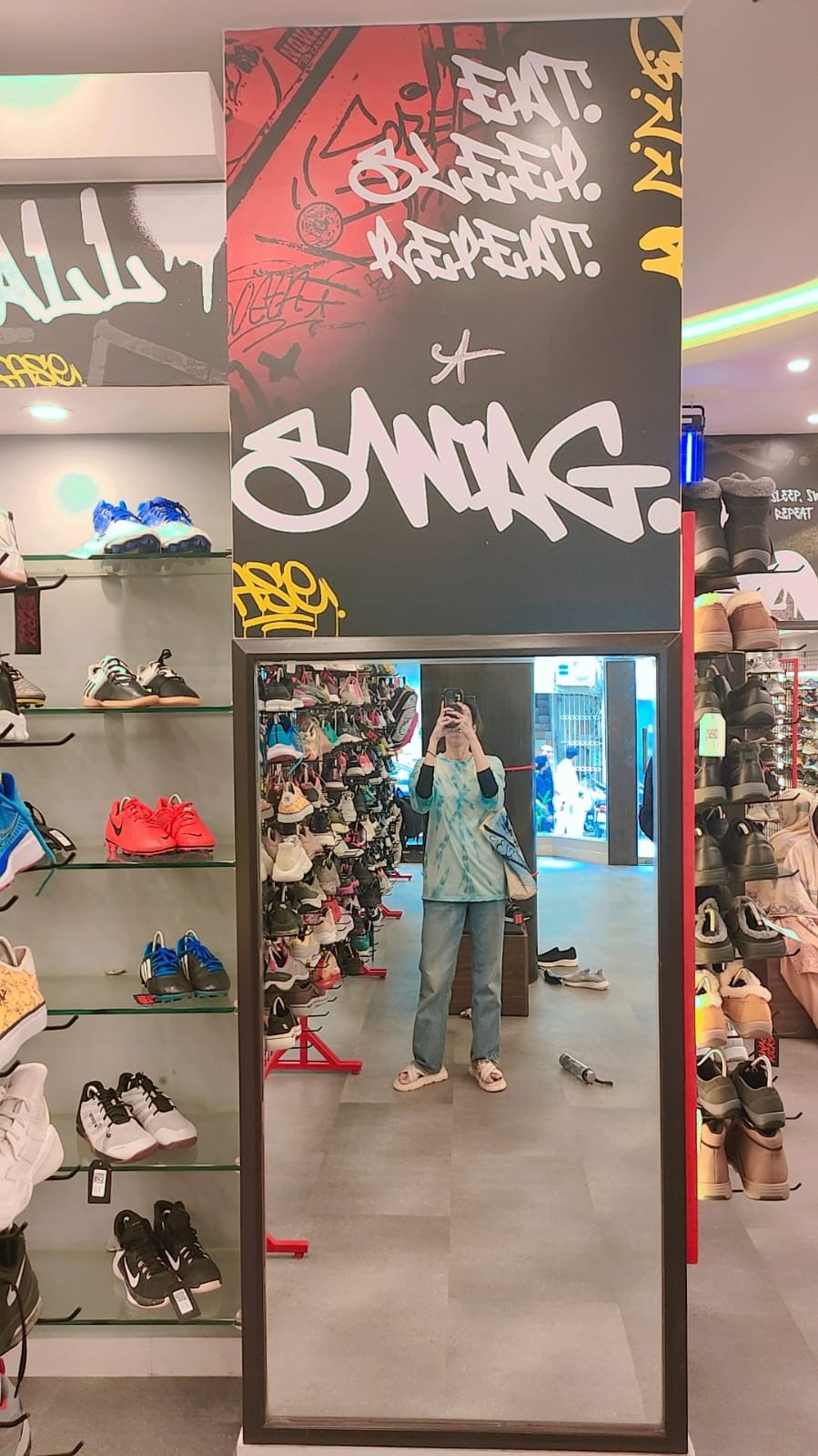
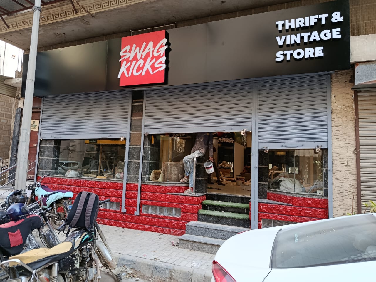
Why This Project Mattered
Having worked as a creative for Swag Kicks, I had already built a strong understanding of the brand, its audience, and the culture it represented.
So when the co-founder reached out for the branding and visual direction of their physical store, it felt like a great opportunity - but also a new challenge.
Retail design was a different space for me. Unlike digital branding, a store is not just something people see. It is something they enter, move through, interact with, and remember.
The Core Challenge
Over the years, Swag Kicks had evolved from a youth-centric thrift brand into something much bigger.
The brand was known not only for sneakers and thrift pieces, but for what it represented:
Street culture, Self-expression
Youth identity
Community
A mindset people wanted to be part of
The main challenge for me was to understand how years of brand equity could be translated into a physical retail space.
Swag Kicks had already evolved from a youth-centric thrift brand into something much bigger. The brand was known not only for sneakers and thrift pieces, but for the culture and community it had built over the years.
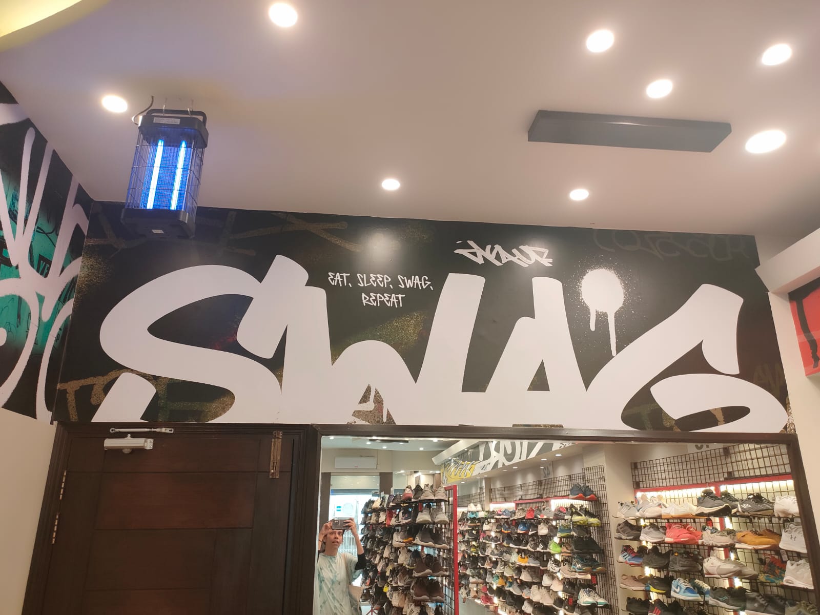
The store had to feel familiar to that community. It could not feel like a separate outlet or a disconnected retail space. It had to feel like Swag Kicks in real life.
The Big Idea
The co-founder’s vision was clear: the outlet had to become more than just a store.
They wanted it to become a third place - a space beyond home and work where people could gather, connect, express themselves, and feel part of the culture.
For me, the goal was to design a space that worked for shopping, but also supported community moments, creative meetups, hip-hop battles, cultural gatherings, and brand-led events.
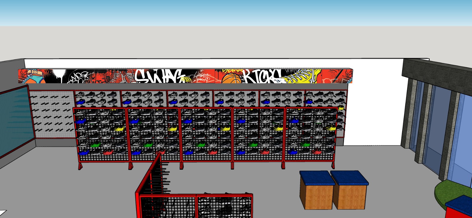
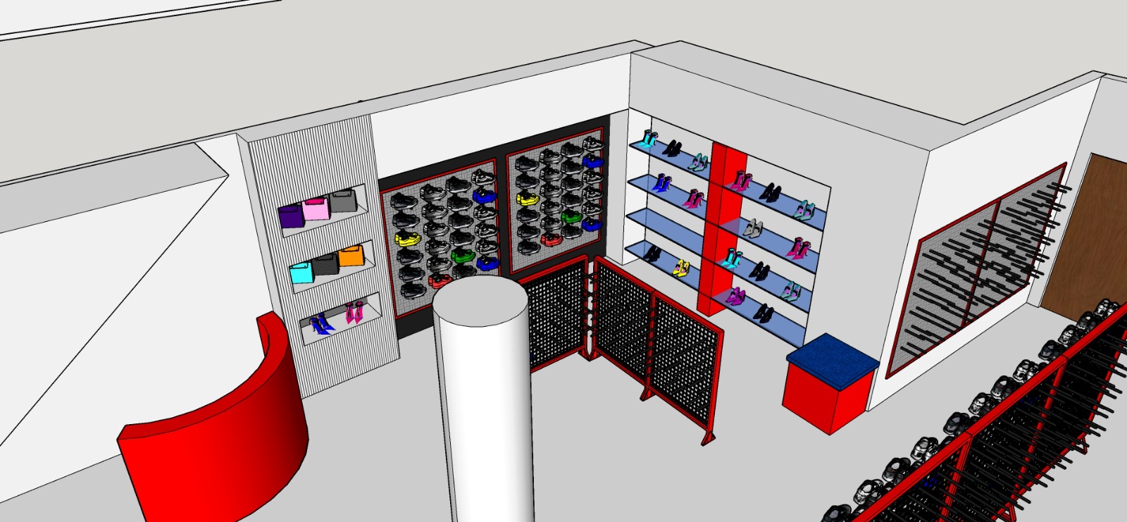
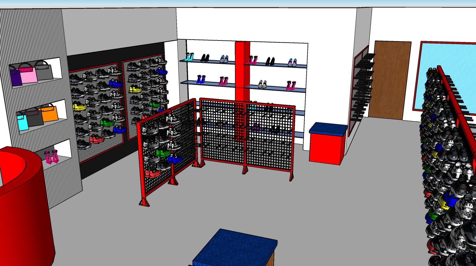
Design Direction
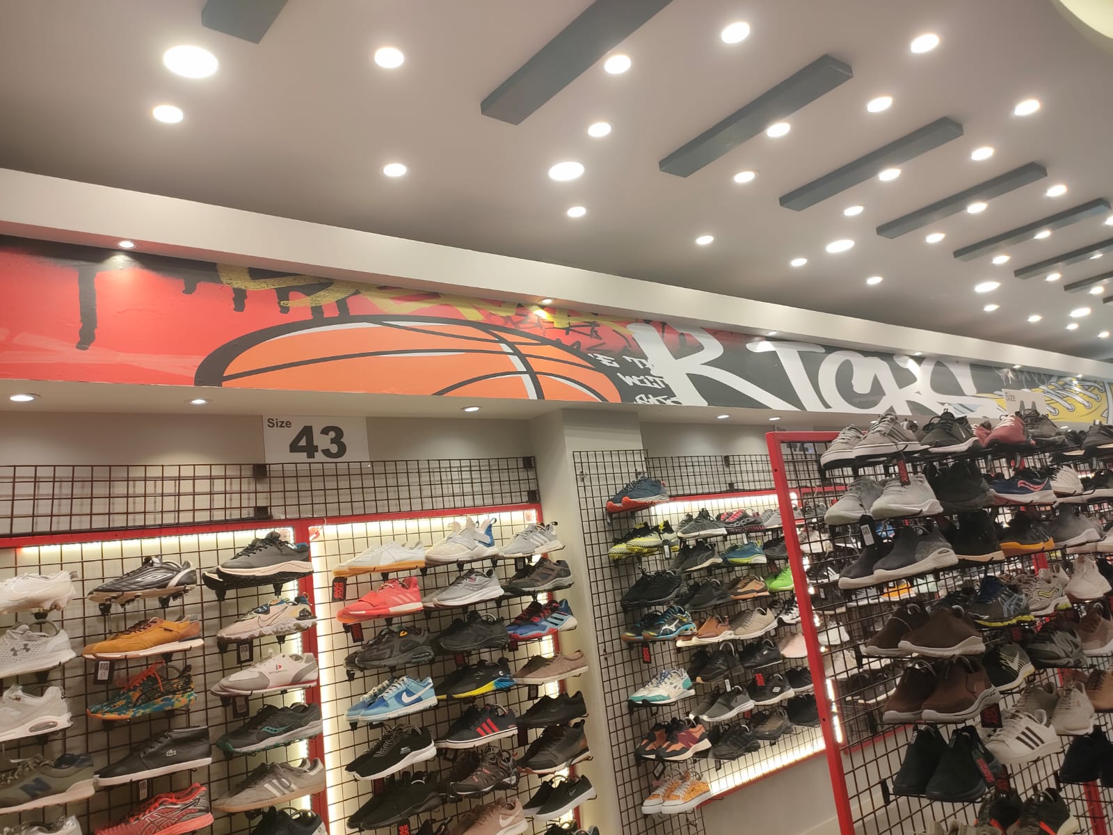
The visual language was inspired by street culture, graffiti, sneakers, and youth energy.
Key design elements included:
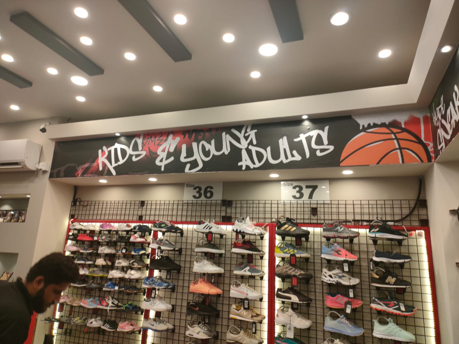
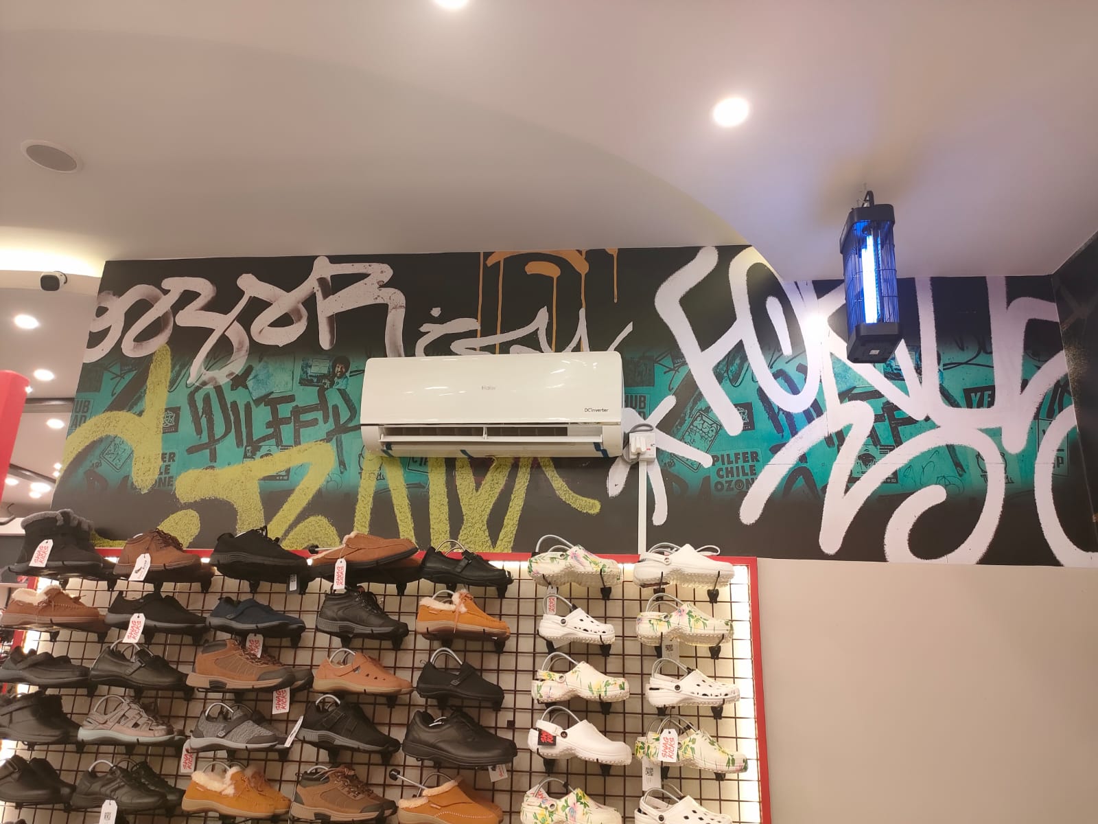
Bold graffiti-style wall graphics
Strong red contrast and display structures
Flexible racks and product walls
Open areas for movement and gatherings
A raw, expressive, community-driven atmosphere
Every element had a purpose. The racks displayed the products, the walls carried the brand attitude, and the layout allowed the space to stay flexible for both retail and community experiences.
The Outcome
The final store became a physical extension of the Swag Kicks identity.
It was not just a place to shop. It became a place to connect, discover, express, and belong.
For me, this project was a major learning experience. It pushed me to think beyond visuals and understand how branding can exist inside a real physical environment.
Final Thought
This project was about turning brand culture into a space.
Swag Kicks had already built a strong community. The store gave that community a physical place to come together.
It became more than a retail outlet - it became a home for the culture.